Comparison
Analysis of Are You Awake? by Sophie Blackall
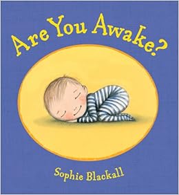
Blackall, Sophie. Are You Awake? Illustrated
by Sophie Blackall. Henry Holt and Company. 2011. 40 pages. Ages 2-5.


Visual Elements
Blackall
uses curved, lines that are soft and thin throughout Are You Awake?. She uses curved shapes except for manmade objects
such as the bedroom window or the bedside table. The texture of her watercolors
is soft and sort of dream-like, which relates to the subject matter of the
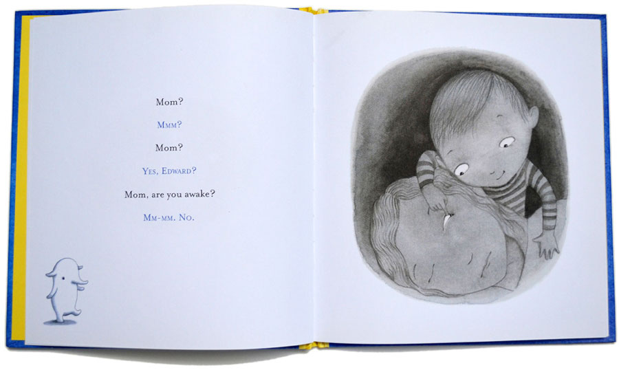
book. At the beginning of the book, the colors are are more neutral grays and
blues, dulled browns. As the story progresses, so too does the colors. The
colors gradually get lighter, with more blues, yellows, pinks and oranges,
signaling the passage of time from night to morning. So to does the value.
Composition
Blackall
takes great care in composing her images. She creates dominance by using
contrast in size, color and brightness. For example, the first few pages in the
book consist of a black circle with white text and white eyes. Later in the
story, she draws your eyes to the clock because it is in the forefront of the
frame. Each illustration is well-balanced. One page in particular is a perfect
example of this. The drawing shows the mother laying down and the son sitting
on top of her looking at the moon. Their two heads and the moon are spaced out
in a way that gives the picture balance. Though there isn’t much contrast in
the beginning of the story because everything is dulled to convey that it is
still nighttime, Blackall builds in contrast and gradations as the pages turn
to show that the sun is coming up. She uses alternation in the form of pajamas
– Edward’s pajamas are striped and his mothers have polka dots. The size and
shape of each illustration varies. For example, the book starts with small
circular shapes, then gets into bigger frames that fill up half the page, then
goes back to smaller circular shapes, then ends with two full-page spreads.
Blackall sustains harmony throughout this story because the edges remain soft
throughout. She creates unity by replcating little parts of the image in the
bigger part of the image. For example, the comforter has stars on it and Edward
looks outside at the real stars.
Medium & Style
As
stated above, Blackall uses Chinese ink and watercolor. The best way to
describe the art in this book is cartoonish. She uses the watercolors in such a
way to create a soft-dream-like feeling.
Analysis of The Five of Us by Quentin Blake
Blake,
Quentin. The Five of Us. Illustrated by Quentin Blake. Tate Publishing.
2014. 40 pages. Ages 4 and up.


Visual Elements
In
The Five of Us, Blake uses his
characteristic straight, scratchy, and thick lines. His shapes are angular –
even things that are supposed to be curvy or round such as a human body have an
angle to them. Some of his shapes lack definition and outlines, like his
clouds, which are just watercolor splotches. His scratchy pen gives the
drawings a rough texture. He is not confined by lines as his colors often go
outside them and there are even some white spots in his painting. He creates
value in that his colors are inconsistent. One part of the grass in a drawing
may be much darker than another part of the grass in the same picture.
Composition
He
creates dominance with his use of circular stone shapes that border certain
images. Despite his nature of inconsistency, all the images in The Five of Us are incredibly well
balanced. He knows exactly where things should be placed to be pleasing and
comforting to the eye. The Five of Us
uses contrast in color and gradation to show the passage of time and contrast
in size – “HELP!” to show a dramatic action. Blake varies the size and shape of
each illustration. Some are full-page spreads, while others are tiny panels. He
creates unity and harmony in the book by being consistently inconsistent on
every page.
Medium & Style
Blake
uses watercolors and a scratchy pen dipped in ink as described in my analysis
of his technique. His style in this book and every book he’s done can be best
described as naïve. It is playful, inconsistent, sporadic, rough and whimsical.
Summary
Both
Blackall and Blake use watercolors, but they use them very differently.
Blackall paints soft, round cartoonish pictures, while Blake paints rough,
sketchy, whimsical pictures. Blackall’s pictures are curved and rounded, while
Blake’s are angular and sharp. Blackall’s paintings have soft but defined
edges, whereas Blake’s often lack definition. Blake’s use of color is
inconsistent and he often goes outside the lines, while Blackall’s use of color
is deliberate and nearly perfectly balanced. Lastly, Blackall’s style is
cartoonish and sweet, while Blake’s is naïve, spontaneous and almost childlike.
No comments:
Post a Comment